A high-converting affiliate landing page does one job well: it preserves the visitor's intent, reduces uncertainty and makes the next step obvious.
The biggest mistake is treating a landing page as a miniature homepage. A visitor normally arrives because of one promise, one keyword, one email, one ad or one recommendation. If the page suddenly introduces five products, six navigation choices, vague claims and competing calls to action, the page has broken the context that earned the click.
This guide uses a practical conversion framework rather than a universal “best conversion rate.” Affiliate offers vary too much by traffic source, price, niche and visitor intent for one benchmark to be meaningful. The goal is to build a page you can measure, improve and defend with evidence.
Quick Takeaway
Build around message match → proof → one primary action. Keep the page useful on mobile, disclose affiliate relationships clearly, measure outbound clicks and conversions where your affiliate platform allows it, and change one major variable at a time when testing.
Free economics check: Before paying for traffic, use the Affiliate Commission & Break-Even Calculator to model commission, refund rate, conversion rate, EPC and maximum break-even CPC.
In This Guide
- Choose the Right Affiliate Landing Page Type
- 1. Start With Message Match
- 2. Build a Hero That Explains the Decision
- 3. Add Evidence Before Persuasion
- 4. Make Affiliate Disclosure Part of the Page
- 5. Use One Primary Call to Action
- 6. Treat Mobile Speed as Conversion Infrastructure
- IM Review HQ 10-Point Landing Page Readiness Checklist
- A Practical Testing Workflow
- Common Affiliate Landing Page Mistakes
- A 7-Step Build Workflow
- FAQ
Choose the Right Affiliate Landing Page Type
“Affiliate landing page” can describe several different page jobs. Choose the page type before writing the copy, because each one needs a different action and amount of explanation.
| Page type | Main job | Primary action | Best when |
|---|---|---|---|
| Review / pre-sell page | Help a reader decide whether an offer fits. | Visit the merchant after reviewing evidence and tradeoffs. | The visitor is researching a named product. |
| Comparison page | Help a reader choose among several options. | Select the best-fit option. | The query includes “vs,” “alternatives” or “best.” |
| Bonus page | Explain the offer plus the extra value tied to buying through your link. | Buy through the affiliate link and follow the bonus-claim process. | You use bonuses to differentiate a promotion. |
| Lead-generation page | Exchange a useful resource for permission to follow up. | Submit the form. | The visitor is not ready for a direct purchase. |
The page type also determines what not to include. A lead-generation page usually does not need a long comparison table. A research-heavy review should not hide limitations in order to look like a one-screen squeeze page. Conversion improves when the amount of information matches the decision.
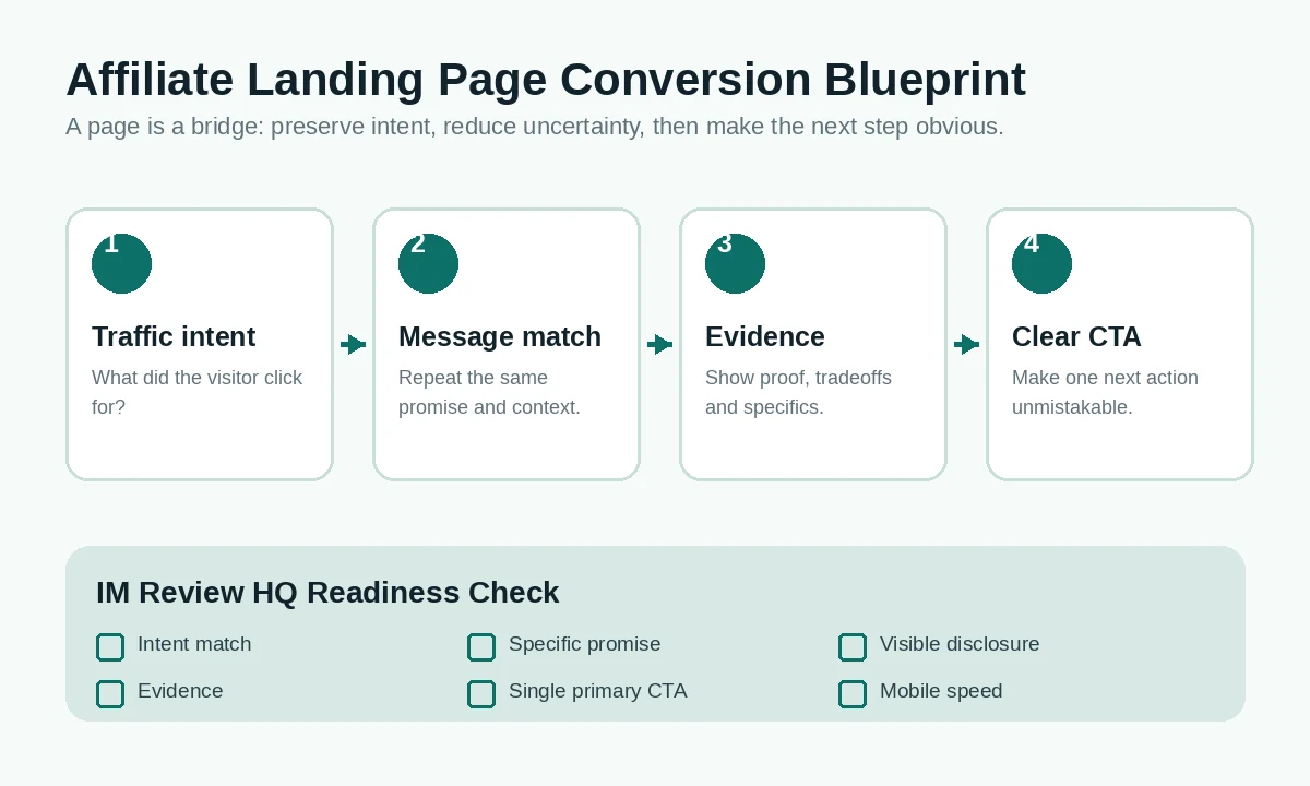
The core flow: preserve the visitor's intent, support the promise with evidence, then make the next action clear.
1. Start With Message Match
A landing page should immediately confirm that the visitor arrived in the right place. If an email promises “See the full cost of this funnel,” the landing page should not open with a generic headline such as “Unlock Your Potential.” If a searcher wants an affiliate landing page checklist, the first screen should make that checklist obvious.
Google Ads' current guidance uses the same principle: the landing page should closely match the ad and keyword, and the call to action on the page should mirror what the visitor was told to expect. Google also evaluates landing-page experience partly by usefulness, relevance, navigation and whether the page meets expectations. Google Ads: optimize ads and landing pages.
For an affiliate page, message match has three layers:
- Traffic source: what the visitor clicked.
- Headline: the promise or decision the page makes.
- CTA: the next action that logically follows from that promise.
If those three elements disagree, more design rarely fixes the problem. Rewrite the page around one intent first.
2. Build a Hero That Explains the Decision
The hero does not have to close the sale. It has to orient the visitor. A useful affiliate hero usually answers four questions quickly: What is this page about? Who is it for? What will I learn or get? What should I do next?
| Weak hero element | Stronger replacement |
|---|---|
| “The #1 revolutionary system” | A specific outcome or decision: “Compare the full funnel cost before you buy.” |
| Generic stock benefit | A concrete reason the page exists for this audience. |
| Three equal CTA buttons | One primary CTA, with secondary navigation visually quieter. |
| Unqualified earnings claim | Evidence, assumptions and limitations the reader can evaluate. |
Keep the first screen scannable. A concise headline, one supporting paragraph, one primary CTA and one meaningful visual are often enough. The rest of the page can answer objections below the fold.
3. Add Evidence Before Persuasion
Affiliate pages are strongest when they reduce uncertainty instead of simply increasing enthusiasm. Evidence can include official pricing, screenshots, documentation, feature limitations, refund terms, public demonstrations, independent comparisons or clearly attributed case studies.
Do not turn every source into a wall of citations. Put the evidence next to the claim it supports. If you say an offer is $47, link to the current official price. If you mention a 30-day guarantee, verify the actual terms. If a vendor gives a results example, label it as a vendor example rather than presenting it as typical performance.
This also helps differentiate useful affiliate content from a thin bridge page. Google Ads advises advertisers to provide useful, original information and make pages easy to navigate rather than sending visitors to low-value destinations. Google Ads landing-page guidance.
A simple evidence hierarchy
- Primary: official pricing, documentation, checkout terms and product demonstrations.
- Independent: credible comparisons, public case studies and user evidence with clear attribution.
- Your analysis: explain what the evidence means for this particular buyer.
4. Make Affiliate Disclosure Part of the Page
Disclosure is part of conversion design because trust depends on readers understanding the relationship behind a recommendation. The U.S. Federal Trade Commission says affiliate relationships should be disclosed clearly and conspicuously, and that the closer the disclosure is to the recommendation, the better. The FTC also notes that wording such as “affiliate link” by itself may not be clear enough for every consumer. FTC Endorsement Guides FAQ.
For a landing page, that means you should not bury the disclosure in the footer while placing commission-generating buttons at the top. Use plain language near the recommendation or first commercial CTA.
A disclosure does not need to dominate the design. It needs to be readable, understandable and positioned where a visitor will actually see it before acting on the recommendation.
5. Use One Primary Call to Action
“One CTA” does not necessarily mean one button. A long page may repeat the same primary action after major decision sections. The important point is that the repeated buttons lead to the same next step rather than competing with unrelated actions.
Good CTA copy describes what happens next:
- Check Current Price
- See the Official Offer
- Get the Free Checklist
- Compare the Two Plans
Vague labels such as “Submit” or “Learn More” can work, but specific next-step copy reduces ambiguity. On a review page, the CTA should come after enough evidence for the reader to understand why the click makes sense.
If your page also has email signup, social sharing and navigation, keep those actions visually secondary. The primary commercial action should be obvious without making the rest of the site unusable.
6. Treat Mobile Speed as Conversion Infrastructure
A conversion page can have excellent copy and still fail if the mobile experience is slow, unstable or difficult to tap. Google Search Central recommends good Core Web Vitals and currently defines the “good” thresholds as Largest Contentful Paint within 2.5 seconds, Interaction to Next Paint under 200 milliseconds and Cumulative Layout Shift below 0.1 at the 75th percentile. Google Search Central: Core Web Vitals.
You do not need to chase a perfect laboratory score at the expense of the page itself. The practical checklist is simpler:
- Compress images and serve appropriate dimensions.
- Avoid loading multiple heavy scripts before the visitor can interact.
- Keep buttons large enough to tap comfortably.
- Do not let sticky bars or popups cover the main CTA.
- Check the entire path on an actual phone, not only in a desktop preview.
Google's page-experience guidance also emphasizes secure delivery, mobile usability, avoiding excessive ads or intrusive interstitials, and making the main content easy to distinguish. Google Search Central: page experience.
IM Review HQ 10-Point Landing Page Readiness Checklist
This is an IM Review HQ editorial checklist, not an industry benchmark, conversion score or prediction of performance. Review each item before sending meaningful traffic and treat every “no” as a specific issue to fix or investigate.
| Check | Question | Why it matters |
|---|---|---|
| 1 | Does the headline match the traffic source? | Preserves intent. |
| 2 | Is there one obvious primary action? | Reduces decision friction. |
| 3 | Can the visitor understand the offer without reading every paragraph? | Supports scanning. |
| 4 | Are important claims supported by current evidence? | Builds credibility. |
| 5 | Are limitations or tradeoffs visible? | Improves decision quality. |
| 6 | Is the affiliate relationship clearly disclosed? | Supports trust and compliance. |
| 7 | Does the page work cleanly on a phone? | Protects mobile conversion. |
| 8 | Does the page load without disruptive layout shifts? | Prevents accidental taps and frustration. |
| 9 | Can you measure the primary click or form action? | Makes improvement possible. |
| 10 | Have you tested the full path through the merchant or thank-you step? | Catches broken journeys. |
How to use it: Treat unchecked items as action items rather than turning the checklist into a performance grade. The framework is not statistically validated and does not tell you whether the offer, traffic source or campaign economics are good. Its purpose is simply to catch structural weaknesses before you spend more time or money driving traffic.
A Practical Testing Workflow
Do not begin by testing button colors. Start with the variables most likely to change the visitor's decision: traffic intent, headline, offer framing, evidence and CTA.
Measure beyond clicks: Use Which Pages Actually Make Money? to identify landing pages that generate disproportionate revenue, and the GSC vs GA4 Traffic Reconciliation Analyzer if organic clicks appear to disappear between Search Console and analytics.
- Record a baseline. Track visits, primary CTA clicks, lead submissions and downstream conversions where available.
- Choose one hypothesis. Example: “Visitors do not understand the main benefit above the fold.”
- Change one major element. Rewrite the headline and supporting sentence, not the headline, button, proof and layout simultaneously.
- Run long enough to collect useful data. Very small samples can swing wildly.
- Keep the winner only if the business metric improves. More button clicks do not help if qualified conversions fall.
If you use paid traffic, the page cannot be evaluated separately from campaign economics. A higher click-through rate to the merchant can still lose money if commissions, refund rates or ad costs do not support the funnel. That is why the Affiliate Commission & Break-Even Calculator belongs in the same workflow.
Where Bonus Pages Fit
A bonus page is a specialized affiliate landing page. It gives the visitor another reason to buy through your link by explaining the extra resources they can receive and how the claim process works. It should still follow the same principles: clear promise, accurate offer information, visible disclosure, specific CTA and a simple path to the merchant.
If you build bonus pages frequently, software can reduce repetitive setup. Our Bonus Builder AI Review examines one tool designed to analyze an offer, suggest relevant bonuses, generate them and assemble a branded bonus page. The review also covers current pricing, upgrade-funnel costs and limitations so you can decide whether automation actually saves enough work to justify another tool.
Common Affiliate Landing Page Mistakes
- Generic AI copy. The page could describe any offer because it contains no current specifics.
- Too many competing actions. Navigation, newsletter, social share, three products and five buttons all compete above the fold.
- Unsupported urgency. Countdown timers or “ending tonight” claims are used without a real deadline.
- Hidden affiliate disclosure. The commercial relationship appears only in a footer link.
- Unverified testimonials or earnings claims. Promotional examples are presented as typical results.
- No mobile acceptance test. The page technically responds to screen size but buttons, tables or overlays are still awkward on a phone.
- No measurement plan. The publisher changes the page based on feeling because no primary action is tracked.
- Optimizing before checking economics. Traffic is purchased before the maximum sustainable CPC or required conversion rate is understood.
A 7-Step Build Workflow
- Write the traffic promise. Copy the actual ad, email subject, search intent or referring-page promise into your notes.
- Choose the page job. Review, comparison, bonus or lead generation.
- Collect evidence. Current price, terms, proof, limitations and the merchant destination.
- Draft the hero and primary CTA first. If those two elements do not make sense together, stop and fix the message.
- Add only the sections needed to answer the decision. Benefits, comparison, proof, FAQ and objections should earn their place.
- Run the readiness checklist and mobile test. Fix structural problems before buying traffic.
- Measure, learn and change one major variable at a time. Treat the page as a controlled decision system, not a finished poster.
The Rule to Keep
A landing page should make the visitor's next decision easier. If a section adds excitement but not clarity, evidence or confidence, it may be working against conversion.
Affiliate Landing Page FAQ
Do affiliate landing pages need to be long?
No fixed length is best. A simple lead-capture page may be short. A product review or comparison may need much more evidence. Use the amount of content required for the visitor's decision.
Should I remove all navigation?
Not automatically. A dedicated campaign page may benefit from reduced navigation, while a research-based review site should still let visitors access trust and policy information. The primary action should be clear without trapping the visitor.
What should I track first?
Track the page's primary action: merchant click, form submission or another clearly defined conversion. Then connect that behavior to downstream revenue or lead quality where your tools allow it.
Can AI write the landing page?
AI can help draft and organize copy, but it cannot substitute for current offer research, real evidence, accurate terms, disclosure or your decision about who the page is for. Generic AI copy is easy to reproduce and often misses the specifics that make a page credible.
Do I need a landing-page builder?
No. You need a page that is fast, readable, measurable and easy to edit. A dedicated builder can be useful if it makes those jobs easier, but it is not a requirement for conversion.
Use the Affiliate Commission & Break-Even Calculator to model the numbers before buying traffic.
See our Bonus Builder AI Review 2026 for its workflow, current pricing, upgrade funnel, alternatives and buyer-fit analysis.